Customization of selling cart. X tips
3 min read

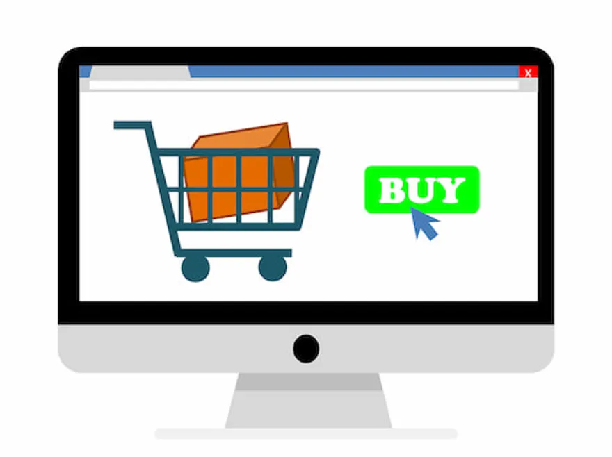
Cart in the online store is an interface which user can use to add products he is ought to purchase.
A simple example: when you shop around the mall you have a cart with you to put there products you are going to buy. You can pay for them in the cashier zone and afterward take them home. The carts in online stores are almost the same.
Sometimes buyer visits the online store and leaves without buying a thing. Usually, we can see that he has abandoned full cart before leaving. One of the reasons for this to happen is poor design and concept of the cart.
How to Design the Cart in Your Online Store?
In order to motivate a client to make a purchase you need to make it display in a common way for the client:
- The cart should be placed on the top right corner.
- The icon should be intuitive - it should look like a cart or bag
- The icon shouldn’t look like a banner - such images get filtered and disaffect the customer
- Near the cart icon, there should be a list of the products put there with their prices and the overall sum
- If there is even one product in the cart then its icon should display that, notifying the customer that cart is not empty anymore.
Cart Mechanism - Basic Functions
After the customer has chosen products to put in the cart he has to be redirected to the checkout page to create an order:
- The image of the cart icon on the page should be intuitive - use three options: a basket, a cart or a bag. Do not be original here and do not use the thumb up or any other icon.
- Icon has to be available on all the site pages and be placed on the same spot all the time.
Inside the cart:
- A customer should have an opportunity to process his orders on the cart page.
- There should be a table with prices of each product separately and the whole sum.
In case the store accepts online coupons the visitor should be able to enter the coupon code and see the product price with discounts.
How to Use The Cart on 100%
- Make a call-to-action to purchase the product
- The button near the product should call the action. Type in the word Order Now or Buy.
- If the button doesn’t contain any text it should be notable, large and have the clear icon
- The Buy button should be placed on all the site pages with the product on the blocks with a short description.
- If someone tries to buy a product that already is in the cart there should be a notification about it.
Order Management
- Customer shouldn’t get confused when he enters the cart page. For example, if he wants to purchase a second item of the same product there should be + and - buttons for that around the quantity raw.
- Customer should always be able to immediately get back to the store - the return button should be visible and bright
- Point out the shipping cost on the cart page
- After completing the order customer should see ‘thank you’ page.
Additional Options
- Set up a widget displaying supplementary products
- Make sure that the history of actions in the cart is recorded - if the customer did not make a purchase yesterday, make sure the items he has put in the cart are available today
Filling Form with Data
Forms with many fields negatively affect the chance for the purchase to be finished. If you create a form with 20 fields to be filled, implement hard captcha, email password verification - each such stage demotivates the customer to complete the purchase. There are many other online stores on the Internet, so keep that in mind when developing forms or any other obstacles to finishing the purchase in one click.
Follow the Minimum Field Approach
Do not abuse pop-down menus - sometimes it is better to let the user type in data on his own. For example, when one has to type in the birth date or the city.
Do not force people to subscribe to your newsletter. This can decrease your deliverability rate as a sender and spoil your reputation in the eyes of the client.
Subscription to Newsletter
We all want to get more data about our clients and get him subscribed on our newsletter. Then the data we get can be used to create personalized offers for our clients. Unfortunately, some of the online stores get users subscribed automatically. Moreover, they do not leave the link to unsubscribe from the mailing. That is a wrong approach. Always get explicit confirmation from users you want to subscribe.
Purchase Stages in the Online Store
There should be three stages of purchase enforced on the website:
- Simple - user enters email or mobile phone number and then gets in touch with the manager. If instead, you can provide a one-click purchase service it should be an intuitive and primitive process.
- New user - after the user clicks registration button he only should enter his name, email, phone number, payment method, and delivery address.
- Signed up user - user enters his login data and all his data is entered in order form automatically.
If the user has to wait more than several seconds for the manager’s response, he estimates this like disrespect to him and his time. Thus, you need to provide an immediate notification about the pending order, so that manager would be able to contact the client ASAP.
Read more in other useful articles on our blog.